Attractive, Accessible Web Sites (AKA disproving the myth of ugly)
Note: The content of this page is very much out-of-date and may no longer be relevant or correct. It is kept here for little more than archival purposes. Please bear this in mind before reading on.
Posted on: 29 August 2003
Web accessibility is not the sexiest subject in the world. Let's be realistic. And selling the concept is never all that easy as a result. Sure, you can harp on about all the 'business benefits' (potential increased audienced, reduced bandwidth costs, good PR), but what you really need to be able to do is show that it's possible to do this without compromising on the design, and that's often where the problems begin.
When thinking about examples of highly accessible sites, perhaps the first ones that crop up are not necessarily fantastic looking examples? Most sites sporting a Bobby AAA or WCAG Level 3 compliant badge also sport a dull interface, unimaginative navigation and are about as sexy as a half-naked octogenarian in an Ibiza nightclub. This is hardly the kind of thing that you want to be showing your boss or prospective client when extolling the virtues of an accessible site.
So, show 'em the good stuff.
What do we want? More! When do we want it? Now!
There are not that many big corporate sites that have gone completely down the road to accessibility. Sure, there may be some token gestures, enough to pass the automated (and essenatially dumb) Bobby Level A test, but very few that, erm, 'push the envelope' (OK, you can slap me for that one). What do I mean by this? Well, as a basic list you might expect this:
- Judicious use of 'Skip Navigation' links or careful ordering of content such that navigation does not get in the way of content (the second approach is perhaps veering into advanced territory)
- No use of drop-down lists (as in the
<select>tag) for navigation (or if it is used, ensuring that it is activated with a Go button and that a<noscript>alternative is provided) - Suitable alt attributes, or blank alt attributes for images when they are not needed
- Sensible link phrases - no 'click here' type links, such that when the user tabs through each link makes sense in its own right
It's not asking much, is it? Like I said, it's a basic list, but we should demand more:
- Table-free layouts that work as well on a handheld device as a PC or Mac with full colour 15" monitor
- Use of
<acronym>and<abbr>elements to clarify abbreviated phrases - Data tables with the
headersandidattributes (making them usable in the likes of Jaws and other screen readers) - A link to an accessibility statement on the home page
- A link to the site map on every page
- No framed content at all (although CSS could be used to make it appear as such)
The list could go on. And indeed, we need to ensure at least one more addition - it's got to look the business! So, how many sites other than personal blogs do all of this?
The Big Boys Should Lead by Example
At this stage I should probably mention Wired News and ESPN - these are two sites that have had extensive coverage because they are biggies (I don't know whether I would describe Wired as 'corporate') that have undergone a massive re-working of their underlying structure. However, despite the very evident use of web standards for layout, they are still not necessarily totally accessible (for example, if you try to access ESPN on Netscape 4 you do not get unstyled text, instead you get to a page explaining why they are unwilling to serve content in that basic format). Beyond these two, can you name many 'HyperMegaGlobalCorp' types who are showing the way?
Enough already, give me some examples ...
So you want some examples of some good lookers then? OK, but first let me explain a couple of things:
- These sites are not the mega corporates that I'd truly like to see in this list, but they are hopefully new to you and have some variety in them
- I have not personally tested them out in a wide range of browsers - I tried them out using Firebird and IE6 on a PC running Windows 2000, and I also took a look at them with the stylesheets disabled to get a feel of how they might look when viewed on a handheld (or other browser that does not support CSS)
Right, that's that out of the way - let's look at some pretty pages ...
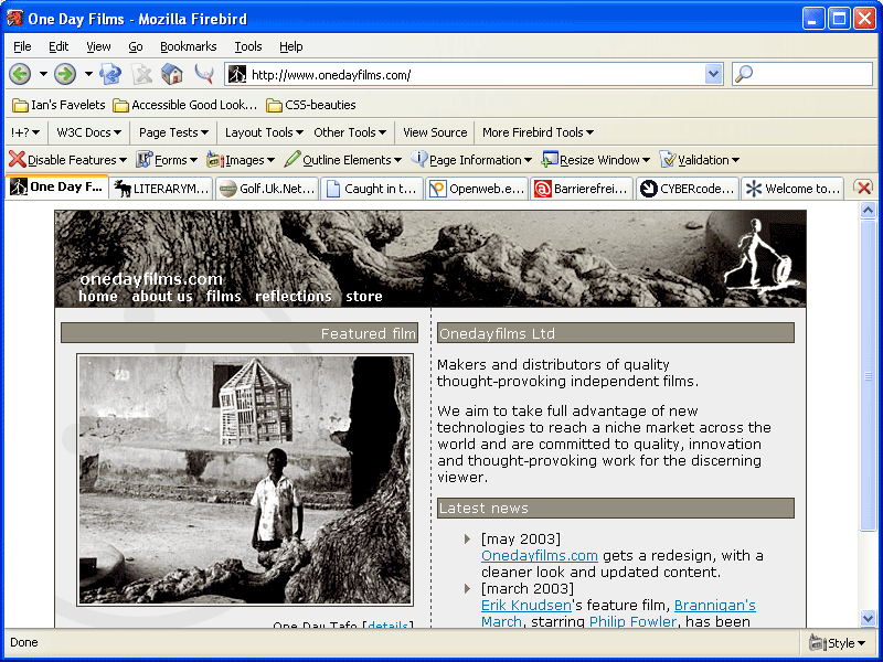
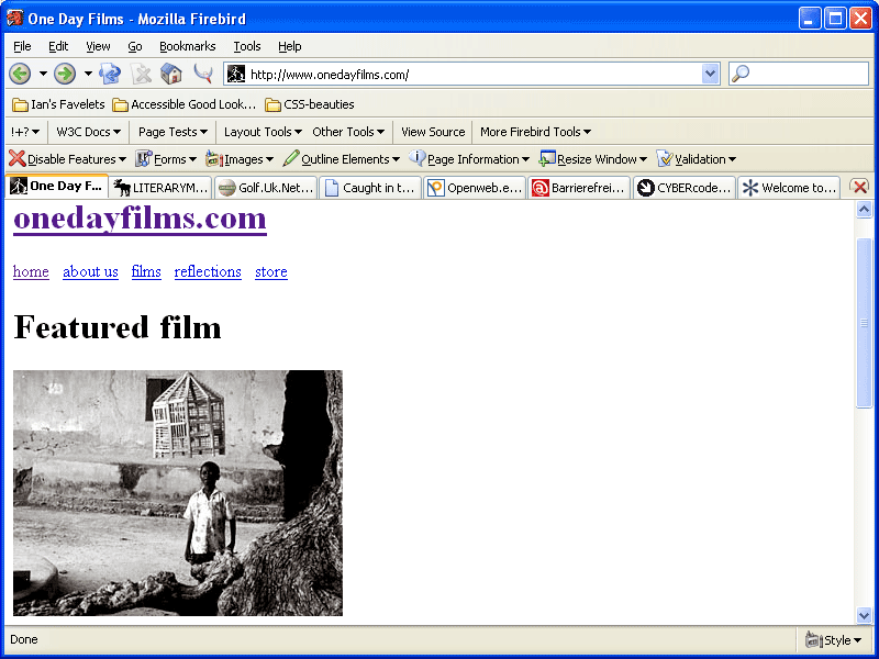
- One Day Films
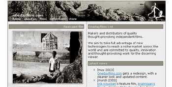
Crafted by Patrick Lauke (a regular poster to Accessify Forum, SitePoint and to this site), One Day Films makes prodigious use of CSS for layout and a clean grayscale palette to achieve a classy finish. With CSS disabled, there's very little obstruction before the main content - almost no need for a skip nav link here.
View screenshot of One Day Films | View One Day films with CSS disabled- Einfach für Alle

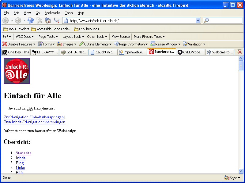
One of the nicest CSS layouts I've seen. Einfach für Alle - which I would translate as 'quite simply for everyone' (but is probably not quite right!) - is the work of Tomas Caspers and is related to a project named Aktion Mensch. You'd have to ask Tomas for more details, but essentially it's a German project related to empowering disabled users in a number of different ways, and the web site is a fine example of attractive and accessible design. Note the use of the<link>element for extra navigational aids (if you are using Mozilla), and there's the old skip navigation link - assuming my understanding of 'Inhalt Überspringen' is correct!
View screenshot of Einfach für Alle | View Einfach für All with CSS disabled- Golf.uk.net
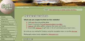
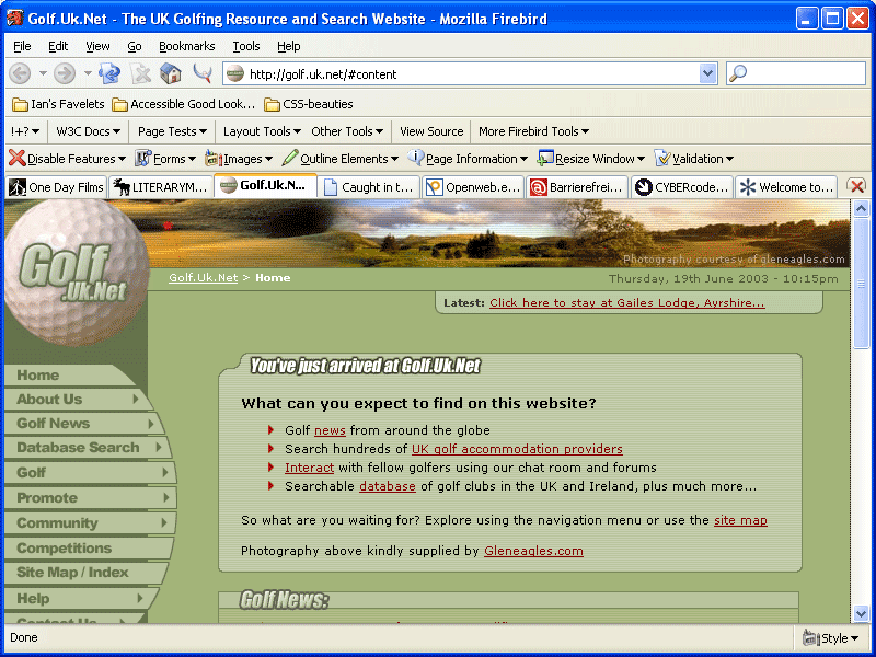
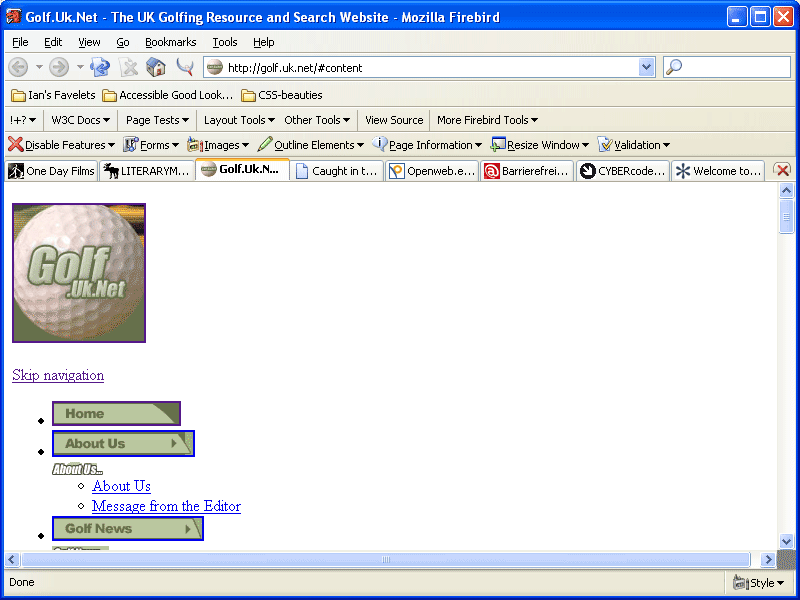
Any guesses what the URL for this site is, heh? This is a piece of work by Tom Gilder, whose name will be known to some from his personal site. I hate golf, but I really like this site - the way it looks and the way it's constructed. This would work quite happily on a PDA without CSS support (although admittedly the sliced graphics look a little odd out of context). Skip nav in the house.
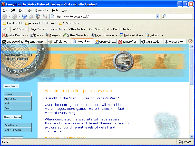
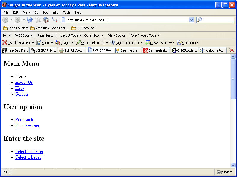
View screenshot of Golf.uk.net | View Golf.uk.net with CSS disabled- Bytes of Torbay's Past
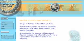
This page looks as far removed from the corporate world as it gets (a historical site about Torbay), and if I'm completely honest the main navigation menus are a little flat for me. However, I was impressed with the separation of the styling from the content (look at the CSS disabled screenshot) and despite my personal disliking for the menu items' simplicity, I like the fact that they are using the right markup for the job, that being list items (<ul><li>) with the appropriate nesting. It feels like a small web site that's been crafted with love.
View screenshot of Bytes of Torbay | View Bytes of Torbay with CSS disabled- Literary Moose

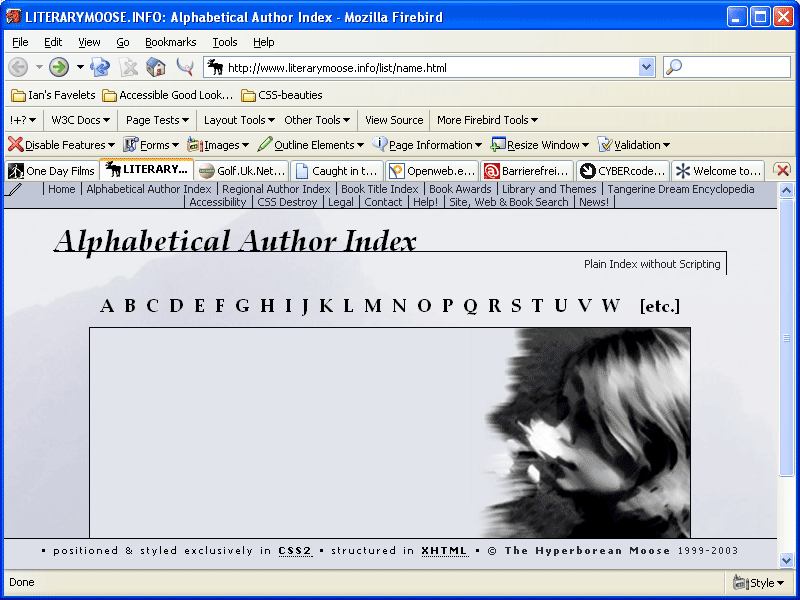
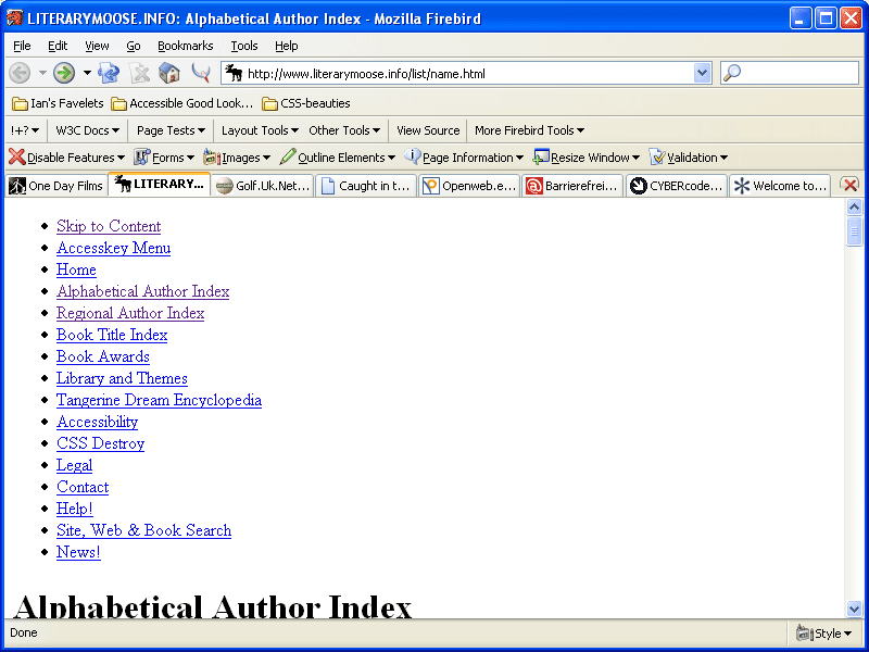
Similar in some ways to One Day Films (OK, the grayscale effect), Wojtek's site, Literary Moose, does not make any bold claims about its support for accessibility, but it's been built in all the same. Accesskeys, skip navigation links, list items for navigation - they're all here.
View screenshot of Literary Moose | View Literary Moose with CSS disabled- Cybercodeur

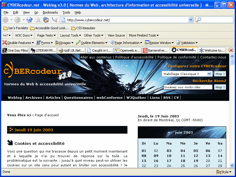
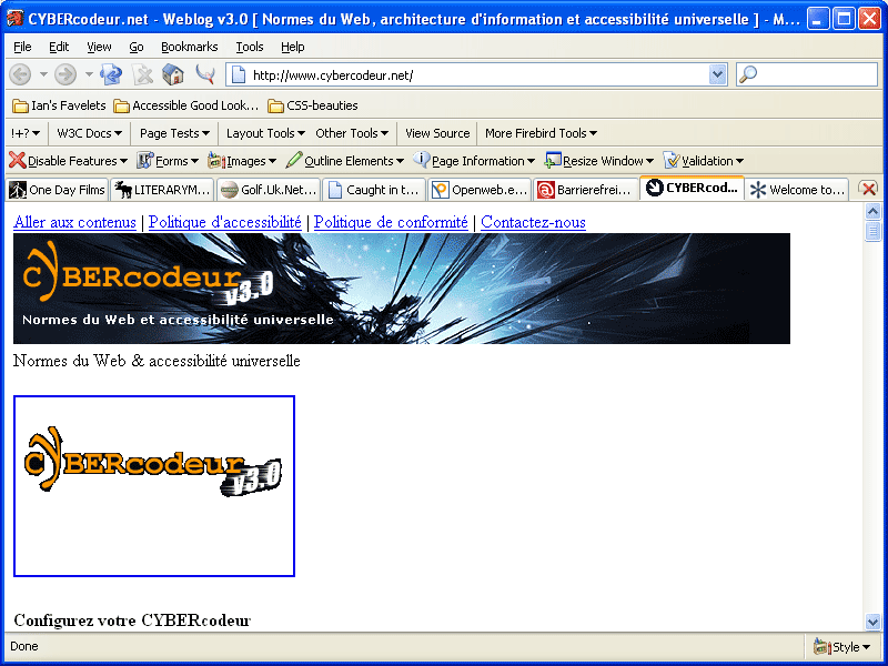
Denis Boudreau may be a name you are familiar with - he is one of a handful of French (or Quebecois) developers who seem to have the notion of web accessibility well and truly worked out, so it's no surprise that his personal web log Cybercodeur demonstrates his knowledge of the topic.'Aller aux contenus' - that'll be your skip nav link in French then. Go take a look at the site today - you are sure of some interesting links.
View screenshot of Cybercodeur | View Cybercodeur with CSS disabled- OpenWeb
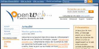
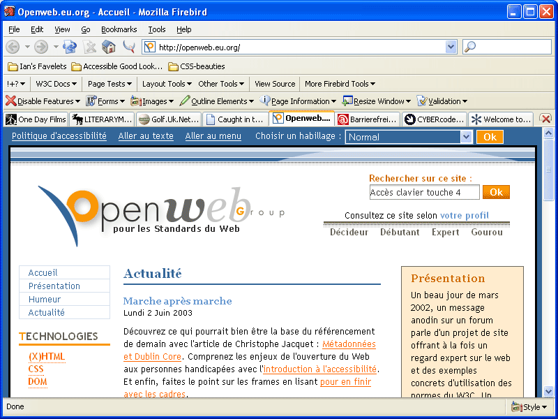
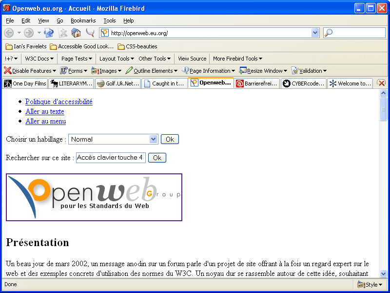
OpenWeb is, if my memory serves me correctly, the work of Tristan Nitot, one-time Netscape employee and general accessibility/standards advocate. The site is a great accessibility resource that offers content based on your level of experience from beginner to expert (assuming that you speak French, that is) and like Denis' site, it practices what it preaches. Another great CSS layout with skip navigation links (not hidden in the fully styled version, incidentally, as many other sites tend to do) and good device independence.
View screenshot of OpenWeb | View OpenWeb with CSS disabled
Rounding off
Well, that's a list of sorts, and I hope you enjoyed taking a look at these examples of accessible design. When I originally asked people to submit suggestions, I was really after examples of sites from major corporates, but alas that has yet to happen - but you can make it happen. Go on over to the Accessify Forum where a new thread has started - 'Attractive and accessible corporate sites' - and tell the world!
This article was written by Ian Lloyd. Ian works as a senior web designer at Nationwide Building Society where they take the matter of accessibility very seriously. Outside of work, he enjoys a spot of scuba diving.